Final Sequence: Dark Summer

Friday, February 26, 2010

Reasearching Titles: Se7en


The titles start with "New Line Cinema Presents", introducing the production company.
In the next shot, the titles "An Arnold Kopelson Production" come up, introducing the producer of the film. Following that is "A Film by David Fincher", introducing the director to us.
In the next shot, we are introduced to the main actors "Morgan Freeman" and "Brad Pitt", there is then a brief flash where the name of the film appears on the screen.
Next we are then introduced to the other actors of the film e.g. Gwyneth Paltrow.
Then members of the crew flash up on screen, firstly the Casting Crew, then the Music Director, then the Costume Designer, followed by the Editor and the Production Designers. Then the Director of Photography, followed by the Co-Producers, Co-Executive and Executive Producers. Finally, the titles mention the writer of the script.


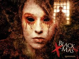
The font used is 'scratchy' and looks as if it has been handwritten. It is also illuminated against shadows in the shots so that it stands out to the audience. This links in with the music used, which is quite unnnerving and tense, connoting a psycological thriller.
Some titles fade into the shot whilst others are jumping, as if to our attention. The fact that the text moves slightly personifies it, suggesting to the audience that events in the film are very much alive. The jumping also indicates that events in the film will not go smoothly for the characters.
Several of the titles flash and are jilting, adding to the tense atmosphere for the audience and putting the audience out of their comfort zone.
Additionally, the timing of the music fits in with the timing of the titles appearing on screen. As well as that the sound effects used e.g. thunder and the sound of a clockwork wound instrument are doubly unnerving.

Despite the name of the fillm appearing early on the the opening, we have planned for the name "Dark Summer" to appear at the end of the opening, as that is when the events climax. It also builds up suspense in the film and delays information being revealed.
We hope to time the titles as well as they were in Se7en, and also to experiment with music and sound effects which give an overall mood to the film.
The use of fonts are also important as they are linked to the genre of the film itself and stand out effectively.

Shot List for the Main Shoot

SHOT LIST Main Shoot

Thursday, February 25, 2010

Ideas For BFE Productions Company Logo

I came up with an idea for the 'BFE Productions' logo that Winnie designed. 

I used Riotsquad front from http://www.dafont.com/ and a london skyline outline image to create this logo.


Then I used the magic wand on Paint Shop Pro to remove the white background so the image was just the logo.  Then I put the logo onto a background of red sky.


Fonts For Impact Films Production Company

For our second production company 'Impact Films', I found some fonts that we could use.  'Impact Films' is supposed to be a production company that specialises in Thriller genre films whereas our main production company, 'BFE Productions' is the professional studio.  So all the fonts I have found for 'Impact Films' are supposed to suit the Thriller genre.


1.  This is our favourite one as it has a typewriter look which is effective and goes with the thriller genre, the letters are unique and clear so we could easily play around with them on Flash.


2.  This one really has a thriller effect so the audience would immediately be able to guess the genre of the film from the font but the letters arn't very clear and we wouldn't be able to change this in any way.


3.  In this one, the letters are very clear and we could easily change this around but I don't think it's suited to a Thriller film.


4.  This one is very similar to Number 2, and with this one you can only have lower case letters which doesn't look as effective.

Wednesday, February 24, 2010

Storyboard For Main Shoot

The storyboard below is the one we will follow during our main shoot.
In this storyboard, we have added in shots 4, 5 6, 7, 15 and 17. We have also changed the ending of the opening, from shot 19 onwards

Shots 4, 5, 6 and 7 help us to further develop the character of Zoe and add more mystery and suspense by adding in a second shot of Zoe from the outside of the house. Shot 15 and 17, which we included in our rough edit show a greater variety of shots of Zoe running up the stairs, which helps to show our technical creativity. Finally we changed the ending of the opening, the new ending being shot 19 onwards, because the first one we drafted on the initial storyboard did not make sense.

Main Shoot Storyboard Group 1

BFE Productions: Company Logo

The logo I have designed above shows the silhouette of the London skyline, including notable landmarks such as Westminster, Big Ben, the London Eye and the Gerkin. The silhouette will be a solid black whilst the background will be of a sunset of reds, yellows and oranges. The text will be a simple white font. Reel, the parent company (we can change this later) is centered between the line underlining BFE Productions.

I was inspired to include the sunset and the London skyline by the scenic images used in the logos of real production companies, such as Paramount and Dreamworks. The sunset is meant to be aspirational, whilst the London skyline show that we are a British company, based in London.

The underlining of the text is inspired by the underlining of Dreamworks in the Dreamworks logo. Also, the text being in white will mean that the name and the name of the parent company will stand out against the black silhouette of London.

The image below shows the finished logo of BFE Productions:

Researching Logos

After close observation of many film company logos, we have noticed that all or most have a scenic image for a background. The above logos all show images of the sky or skyline, which signifies aspirational qualities. As they all have this similar feature, and as all are large, successful companies we could incorporate a scenic image in our production company logo as well.

The font used in each logo could also be regarded as synonymous with the company itself. For instance, the Paramount and 20th C Fox fonts used are easily recognisable, further creating a brand image. In contrast, the fonts used for Dreamworks and WB are quite basic and simple, this does not over-complicate the logo and the image.

Addtionally, they all feature their names of their parent companies i.e. A Time Warner Company. This branding is significant as it shows they are part of larger companies which are partly responsible for their successes. Incorporating an additional name would also suggest professionalism; we could attempt to include this in our own logo.

Shooting Schedule

We are shooting on Friday 26th February from 4:30 - 9:00pm and Sunday 26th February from 4:30 - 8:00pm at Michael's house again.  We are filming quite late so it is dark outside for our shots.

Tuesday, February 23, 2010

Re-shoot

We have decided that some shots could be improved and sequences (like in the bedroom) can be completely redone. There are 3 main parts to re-shoot, which are:
  • Fridge shot - stranger at the door: we should only see him once, after Zoe has closed the fridge, so that there is some suspense in the beginning. Also, he should be trying to open the door, so the audience would see the handle moving, but again, Zoe won't.
  • Reaction shot of Zoe: should be more realistic. Also, when she drops the cup, the juice should be really red, rather than watery as the red is a signifier of blood and murder which is vital to the rest of the film.
  • Bedroom sequence:
    • Zoe runs in quickly to the bed. She sees Summer in bed with her hair sticking out. Saying "Thank God," she walks around, tidying up.
    • She tidies crayons and drawings and notices a strange picture. There is a music box and teddybear on the floor. The teddybear has a red ribbon, again connoting murder She puts the music box on the bedside table and goes to tuck Summer's teddybear in her bed.
    • As she pulls back the covers to place the bear, she realises that what she though was Summer is actually a doll and not in the room. She starts screaming and backs away towards the wall.

Tuesday, February 9, 2010

Editing Our Sequence

:
EDITING
After filming our sequence we have began to edit it so that the continuity is perfect and it flows properly. We have been able to clarify which parts we will need to re-shoot, such as the cup falling on the floor  (as the reaction is not very realistic and the cup falls awkwardly) or Zoe in the bedroom (because it would be useful to have other endings as the one we have now isn't quite right.)

FEEDBACK:

What went well:
  • First shot- phone, see 'Mrs Matthews', some characterisation
  • Good actress, realistic + believable
  • Location, homey and good colours
  • Outside shot, from garden
  • Match on action - opening fridge
  • Sound - music box, eerie
  • Stairs - lots of good cuts, variety + quick pace signify frantic + urgency
  • MES - room: rocking horse, drawings
Improvements:
  • Reaction shot in kitchen- not very believable
  • Juice on floor - not red enough
  • Walking in to room - more urgency. Why does she look around? Doesn't make sense
  • Tidy kitchen so it's not as cluttered. Needs to look like a 'hollywood home'
  • Stairs - even though there's variety it's a bit choppy
  • SFX:
    • panting as she runs up stairs
    • Michael at the door - could he be trying to open it?
  • Music - should be added, at least at the beginning to signify a thriller film.

Props: Creating Atmosphere


We created drawings that could be placed in the child's room so that it looked more authentic and realistic. We used crayons, as the child is supposed to be quite young. One drawing showed the child with her parents. The parents' eyes were crossed out, maybe connoting that they will be killed. Showing this on screen would create a mystery to the audience, leaving them with questions.

Michael is the stranger who we see at the door and looks in on Zoe from the garden as she is in the kitchen. He wears a white mask and dark clothing. We are also filming when during the evening so he will blend into the darkness, while the mask stands out. This creepiness disturbs the atmosphere as Zoe will not see him but the audience is aware of his presence. The fact that he is posed in an awkward stance is eerie.


Sunday, February 7, 2010

Initial Storyboard

Initial Storyboard Group1

This is the finalised initial storyboard which we made after completing the timeline. It is necessary to do this in order to keep our notes in order and so that when filming, we will be organised, with all members of the group, including the actors being aware of what shots we need to achieve.

When we film, we may realise that some parts of the storyboard do not flow properly and may not make sense, so we will have to improvise and add in extra shots. However, the storyboard will act as a rough guide for us when it comes to shooting.

I drew the shots in a linear fashion so as to simplify things for all members of the group and make it as clear as possible to the viewer. Michael and Jess also annotated the shots, commenting on aspects of the opening, such as shot type and music.

Friday, February 5, 2010

Script

Script for Opening Sequence

The script is vital is it important for our actress to know what she is saying and doing. This aids the shot list and storyboard, describing appearances and setting, which adds to the mood we are trying to create. I wrote the shotlist in a typical way that would appeal to professionals in the industry. The font looks appropriate for a real film and the layout is clear and easy to read so actors can see their lines easily and directors are able to refer to it at any time.

Shot List

Shot List

The shot list very useful for planning. When filming we don't have to think about when to shoot and where. This makes it clear of the order to shoot so that we don't waste time on the day.

Wednesday, February 3, 2010

Planning: Timeline


This is our finished timeline from the group meeting. We drew up each shot onto post-it notes so that we can easily move around shots if we decide to make changes. So far, we plan on having around 24 shots including opening and ending titles. Also, below each drawing we have annotated so we can easily know what is happening in each shot. Furthermore, above the drawings, we have noted where the titles will go and what these titles will be, along with estimations on the duration of each shot. This should be helpful during the editing stages for us to refer to and gives us a rough idea of how long our opening will be.

Third Group Meeting

We had our third group meeting in which we finished the group timeline and made a start on the shot list. With the timeline, we have also noted the rough duration of each shot so we have an idea on the length of the overall piece. We have also agreed on which days we will shoot and at what times. We have given our actor notice of this and she can make both.


We will shoot at my house on these days for our first shoot. Also, on the two days of shooting, we have decided for them to take place on different times of the day. This is so that we can test which lighting will be more effective for our shoot, in the evening when it is darker outside or during the day when it is lighter. Then after we will decide what lighting would be the best for scene of the masked man by the window. During our next meeting, we will arrange the dates of our other shoot if some shots do not work out how we would like them to.

Props List

General:
  • plastic cups
  • red drink (strawberry Ribena or Vimto)
  • mobile phone
  • music box
  • rocking horse
  • child's drawings
  • crayons/pencils
Actors:
  • mask
  • black coat/hoodie
  • black jeans
  • casual tops
  • jeans
  • plain shoes (not branded)
  • socks
  • red coat

Tuesday, February 2, 2010

180 and 30 Degree Rule

In film-making, it is important to keep the film flowing, with no interruptions to disrupt the audiences viewing experience. We call this continuity editing. The purpose of continuity editing is to make sure that any signs of discontinuity made apparent during the editing phase are smoothed out, in order to make sure that the shots cohere with each other.
The two basic rules of continuity are the 180 degree rule and the 30 degree rule.

THE 180 DEGREE RULE
The 180 degree rule states that two (or more) characters in the same scene must stay in the same left/ right position to each other. For instance, if Character A were sitting on the left facing to Character B, who is sitting on the right facing to the right towards Character A, they must not at any time face in the opposite direction to the one they were originally facing. This would disorient the viewer and disrput the continuity of the scene.
The image above shows a red line connecting the figures. In order to keep to the 180 degree rule, the camera must not move over the line to the left hand of the characters facing right.

THE 30 DEGREE RULE

The two shots above show the breaking of the 30 degree rule. The camera must move at least 30 degrees in agle between two shots of the same subject. By doing this, we see a substansially different shot of the subject without it looking too close to the previous one. By obeying the 30 degree rule we avoid making it look like a jump cut, which can be distracting for the viewer.
However, we need to avoid moving the camera around too much, so as to avoid breaking the 180 degree rule.

Visual Effects and Transitions

Visual effects are usually added on to a film to enhance its mood and overall tone of the narrative. It can make a romantic scene appear more sensual or an action scene seem more invigorating. Although visual effects are added on to a sequence during the editing stage of the film there is a necessity to plan its use in advance, preferably on the storyboard, so that it does not look as if it was added on as an afterthought. Below are some examples of effects and transitions

Fade effect
For our opening sequence, the fade can be used to great effect. The genre of our film is psychological thriller, and most of the film is based on the mystery of the kidnappings. A fade effect used in the context of our film would add to the mysterious tone, as it connotes that there are several layers of information to be uncovered, as the images and shots are literally faded into one another.


Dissolve effect
The dissolve effect also connotes mystery and suspiscion as a fade effect would. As they are very similar, the audience may not realise the difference between the two is they were both used. Therefore, it may be best to use one or the other effect, so as not to overload the use of visual effect and make the overall tone appear less subtle.

Wipe effect
The wipe effect is altogether not as subtle as the other two effects previously mentioned. A wipe is a gradual transition from one image to another. The previous image is replaced by another with a distinct edge that forms a shape. The most common are and expanding circle from the centre or a turning page corner.
This effect does not suit the tone and mood of our opening sequence so it is not likely that we will use it. If our film were of of more light hearted tone, we could use a wipe effect for our titles as that would be more subtle than using wipes on our shots and images.


Jump cut
The jump cut is when two sequential shots vary only slightly in angle from one another. It is usually considered a violation of the 30 degree rule.
The clip below is a demonstration of the jump cut, from Jean-Luc Godard's Breathless (1960). The camera angle on the boy in the passenger seat of the car varies slightly in angle. This was not accidental and was created by Godard to disconcert the audience.
Watching the clip, I find the use of the jump cut distracts my attention from the narrative of the film itself. If'we used this, the audience's attention on the film would be disrupted and they would not be fully immersed in the film as we would like them to be.


Slow motion
The use of slow motion in film editing can help add mood and tone in many different ways. If we were to use slow motion in our sequence, by slowing a shot down we would heighten and increase tension by keeping the audience on the edge of their seats as we delay the events following them.
The clip below shows a bullet moving in slow motion. As the bullet passes through the objects we can see clearly the effect it has on those objects. We could use this technique on the shot were the bottle of red juice spills on the ground in our sequence, to show the significance of it falling on the ground and to show the audience that something bad to will happen following the spilling of the juice.

Monday, February 1, 2010

Possible Titles of Film and Fonts

During our group meeting, we brainstormed possible names for the film that we will be producing an opening sequence for. We managed to narrow this down to our top five favourites. The font of the title is also important as we want it to be striking and to link in with the narrative. The website that we will be using is dafont.com and most of the members of our group have experience of this website from past projects.


This title is inspired from films such as Black Christmas, which play on words quite cleverly. In this case, the two words when separated contrast as Christmas is a time of happiness, snow and joy whereas black connotes darkness and impurity. I think that Dark Summer could work just as well as Summer is a time of sun, youth and freedom but the darkness casts a shadow over this. This metaphor could link in to our movie because the girl, Summer, gets kidnapped, thus setting a tone for the rest of the film as we are trying to work out who abducted her.


Name: As the girl who goes missing within the film is called Summer, we decided to play with the name incorporating it in our film title. There is also ambiguity with Summer being both a name and a season and the word 'Dark' fits in with the genre Psychological Thriller as often has a dark plot.

Font: The font is called 'Distorted and Scratchy' (dafont.com) and I think it looks overall quite effective. It is bold and easy to read, the scratches of the text makes it seem edgy and shady.


Name: We have used the name of the missing child once again in our title and I think this name is quite strong. The word 'screams' connotes someone being in danger and trying to make themselves heard to get out of an unpreventable situation.

Font: This font is 'Times New Yorker', and the simplicity makes the text visually clear which is needed for the opening titles. The font is similar to the font used on a newspaper headline which, links with the aspect of crime. However, there are small ink smudges in the font that look quite rough and disturbed with.


Name: Abducted was the first name that we came up with and it is very simple and ties in with the narrative so that the audience can have a rough idea of the outline plot. However, there is also enigma as we do not know who or what has been abducted.

Font: 'Charles S' is the style of font and it fits in with the genre as it is bold and eery. I like the distortedness of the font because it is unique and is not the typical style of writing that you would see in other film openings.


Name: Masked was another suggestion made in our group meeting and it is another possibility. It does not give away much and there is hidden identity which links into the masked man who we see in the opening sequence. This can link to the plot in the rest of the film as it suggests that the man who appeared at the window plays a very important part in future events.

Font: This is 'Script Serif' also taken from dafont.com and is one of my favourites of the styles which I researched. I like the sharp edges and uneven boxes as it looks uncertain and has a mixed identity. This font stands out hugely and I think it would work well.


Name: This name is the most simple from the list and is to the point. Obviously, we can tell that it has relevance to something which has disappeared and faded away. However, this name may be too simple and not effective enough at delivering the overall message of the plot.

Font: The font style called 'All Used Up', is faded and this links to the fading away of something important. There are some parts which are bolder than the rest and the scratches show pain.