During our group meeting, we brainstormed possible names for the film that we will be producing an opening sequence for. We managed to narrow this down to our top five favourites. The font of the title is also important as we want it to be striking and to link in with the narrative. The website that we will be using is dafont.com and most of the members of our group have experience of this website from past projects.

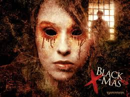
 This title is inspired from films such as Black Christmas, which play on words quite cleverly. In this case, the two words when separated contrast as Christmas is a time of happiness, snow and joy whereas black connotes darkness and impurity. I think that Dark Summer could work just as well as Summer is a time of sun, youth and freedom but the darkness casts a shadow over this. This metaphor could link in to our movie because the girl, Summer, gets kidnapped, thus setting a tone for the rest of the film as we are trying to work out who abducted her.
Name: As the girl who goes missing within the film is called Summer, we decided to play with the name incorporating it in our film title. There is also ambiguity with Summer being both a name and a season and the word 'Dark' fits in with the genre Psychological Thriller as often has a dark plot.
Font: The font is called 'Distorted and Scratchy' (dafont.com) and I think it looks overall quite effective. It is bold and easy to read, the scratches of the text makes it seem edgy and shady.
Name: We have used the name of the missing child once again in our title and I think this name is quite strong. The word 'screams' connotes someone being in danger and trying to make themselves heard to get out of an unpreventable situation.
Font: This font is 'Times New Yorker', and the simplicity makes the text visually clear which is needed for the opening titles. The font is similar to the font used on a newspaper headline which, links with the aspect of crime. However, there are small ink smudges in the font that look quite rough and disturbed with.
Name: Abducted was the first name that we came up with and it is very simple and ties in with the narrative so that the audience can have a rough idea of the outline plot. However, there is also enigma as we do not know who or what has been abducted.
Font: 'Charles S' is the style of font and it fits in with the genre as it is bold and eery. I like the distortedness of the font because it is unique and is not the typical style of writing that you would see in other film openings.
Name: Masked was another suggestion made in our group meeting and it is another possibility. It does not give away much and there is hidden identity which links into the masked man who we see in the opening sequence. This can link to the plot in the rest of the film as it suggests that the man who appeared at the window plays a very important part in future events.
Font: This is 'Script Serif' also taken from dafont.com and is one of my favourites of the styles which I researched. I like the sharp edges and uneven boxes as it looks uncertain and has a mixed identity. This font stands out hugely and I think it would work well.
Name: This name is the most simple from the list and is to the point. Obviously, we can tell that it has relevance to something which has disappeared and faded away. However, this name may be too simple and not effective enough at delivering the overall message of the plot.
Font: The font style called 'All Used Up', is faded and this links to the fading away of something important. There are some parts which are bolder than the rest and the scratches show pain.


No comments:
Post a Comment