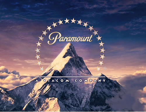
After close observation of many film company logos, we have noticed that all or most have a scenic image for a background. The above logos all show images of the sky or skyline, which signifies aspirational qualities. As they all have this similar feature, and as all are large, successful companies we could incorporate a scenic image in our production company logo as well.
The font used in each logo could also be regarded as synonymous with the company itself. For instance, the Paramount and 20th C Fox fonts used are easily recognisable, further creating a brand image. In contrast, the fonts used for Dreamworks and WB are quite basic and simple, this does not over-complicate the logo and the image.
Addtionally, they all feature their names of their parent companies i.e. A Time Warner Company. This branding is significant as it shows they are part of larger companies which are partly responsible for their successes. Incorporating an additional name would also suggest professionalism; we could attempt to include this in our own logo.


No comments:
Post a Comment