The audience feedback we got from the audience during the screening was mixed. We had over 30 people attend, filling in questionnaires and the majority were able to identify the themes, target audience and genre of our opening.
Many of the comments were very positive and there was also a lot of constructive criticism to take into account. Below is an example of a questionnaire that was filled in by a member of the audience.
Audience Feedback
Showing posts with label Research. Show all posts
Showing posts with label Research. Show all posts
Tuesday, March 30, 2010

Tuesday, March 9, 2010
Sound Effects
When researching music for our opening sequence, we used a website called freeplaymusic.com, a website full of copyright free music. We found some possibilities to go with the actual footage and also sound effects for when the production company logo appears. The category of music in which we searched was, building tension and intensity.
www.freeplaymusic.com/search/category_search.php?sindex=11&i=70&t=s
Option 1: Off Center- This was one of our favourites from the beginning. The music starts of slow and then builds up. There is a lot of tension and the echos within the music adds an edge and fits in with the genre of our film quite well.
Option 2: The Under World- This is also a possibility. The music starts of very quiet and than rapidly gets louder with sound effects in between creating a very spooky feel. This could work well, however only if we fitted the timing of the music and the sequence effectively.
Also, for our production logo of BFE Productions, I thought that we could use the first three seconds of 'Undercurrents' as it sounds similar to the sounds used in other production company logos and sounds professional.
Another posibility music wise to go with the production logo, is 'Behind the Haze', which sounds very cinematic and exciting. This is our favourite track so far out of the ones we listened to and can be found on this link: http://www.freeplaymusic.com/search/category_search.php?t=s&i=71
www.freeplaymusic.com/search/category_search.php?sindex=11&i=70&t=s
Option 1: Off Center- This was one of our favourites from the beginning. The music starts of slow and then builds up. There is a lot of tension and the echos within the music adds an edge and fits in with the genre of our film quite well.
Option 2: The Under World- This is also a possibility. The music starts of very quiet and than rapidly gets louder with sound effects in between creating a very spooky feel. This could work well, however only if we fitted the timing of the music and the sequence effectively.
Also, for our production logo of BFE Productions, I thought that we could use the first three seconds of 'Undercurrents' as it sounds similar to the sounds used in other production company logos and sounds professional.
Another posibility music wise to go with the production logo, is 'Behind the Haze', which sounds very cinematic and exciting. This is our favourite track so far out of the ones we listened to and can be found on this link: http://www.freeplaymusic.com/search/category_search.php?t=s&i=71
Friday, February 26, 2010
Reasearching Titles: Se7en

The titles start with "New Line Cinema Presents", introducing the production company.
In the next shot, the titles "An Arnold Kopelson Production" come up, introducing the producer of the film. Following that is "A Film by David Fincher", introducing the director to us.
In the next shot, we are introduced to the main actors "Morgan Freeman" and "Brad Pitt", there is then a brief flash where the name of the film appears on the screen.
Next we are then introduced to the other actors of the film e.g. Gwyneth Paltrow.
Then members of the crew flash up on screen, firstly the Casting Crew, then the Music Director, then the Costume Designer, followed by the Editor and the Production Designers. Then the Director of Photography, followed by the Co-Producers, Co-Executive and Executive Producers. Finally, the titles mention the writer of the script.
The font used is 'scratchy' and looks as if it has been handwritten. It is also illuminated against shadows in the shots so that it stands out to the audience. This links in with the music used, which is quite unnnerving and tense, connoting a psycological thriller.
Some titles fade into the shot whilst others are jumping, as if to our attention. The fact that the text moves slightly personifies it, suggesting to the audience that events in the film are very much alive. The jumping also indicates that events in the film will not go smoothly for the characters.
Several of the titles flash and are jilting, adding to the tense atmosphere for the audience and putting the audience out of their comfort zone.
Additionally, the timing of the music fits in with the timing of the titles appearing on screen. As well as that the sound effects used e.g. thunder and the sound of a clockwork wound instrument are doubly unnerving. Despite the name of the fillm appearing early on the the opening, we have planned for the name "Dark Summer" to appear at the end of the opening, as that is when the events climax. It also builds up suspense in the film and delays information being revealed.
We hope to time the titles as well as they were in Se7en, and also to experiment with music and sound effects which give an overall mood to the film.
The use of fonts are also important as they are linked to the genre of the film itself and stand out effectively.
Thursday, February 25, 2010
Ideas For BFE Productions Company Logo
I came up with an idea for the 'BFE Productions' logo that Winnie designed.


I used Riotsquad front from http://www.dafont.com/ and a london skyline outline image to create this logo.

Then I used the magic wand on Paint Shop Pro to remove the white background so the image was just the logo. Then I put the logo onto a background of red sky.


Fonts For Impact Films Production Company
For our second production company 'Impact Films', I found some fonts that we could use. 'Impact Films' is supposed to be a production company that specialises in Thriller genre films whereas our main production company, 'BFE Productions' is the professional studio. So all the fonts I have found for 'Impact Films' are supposed to suit the Thriller genre.

1. This is our favourite one as it has a typewriter look which is effective and goes with the thriller genre, the letters are unique and clear so we could easily play around with them on Flash.

2. This one really has a thriller effect so the audience would immediately be able to guess the genre of the film from the font but the letters arn't very clear and we wouldn't be able to change this in any way.

3. In this one, the letters are very clear and we could easily change this around but I don't think it's suited to a Thriller film.

4. This one is very similar to Number 2, and with this one you can only have lower case letters which doesn't look as effective.
Wednesday, February 24, 2010
Researching Logos



After close observation of many film company logos, we have noticed that all or most have a scenic image for a background. The above logos all show images of the sky or skyline, which signifies aspirational qualities. As they all have this similar feature, and as all are large, successful companies we could incorporate a scenic image in our production company logo as well.
The font used in each logo could also be regarded as synonymous with the company itself. For instance, the Paramount and 20th C Fox fonts used are easily recognisable, further creating a brand image. In contrast, the fonts used for Dreamworks and WB are quite basic and simple, this does not over-complicate the logo and the image.
Addtionally, they all feature their names of their parent companies i.e. A Time Warner Company. This branding is significant as it shows they are part of larger companies which are partly responsible for their successes. Incorporating an additional name would also suggest professionalism; we could attempt to include this in our own logo.
Tuesday, February 2, 2010
180 and 30 Degree Rule
In film-making, it is important to keep the film flowing, with no interruptions to disrupt the audiences viewing experience. We call this continuity editing. The purpose of continuity editing is to make sure that any signs of discontinuity made apparent during the editing phase are smoothed out, in order to make sure that the shots cohere with each other.
The two basic rules of continuity are the 180 degree rule and the 30 degree rule.
THE 180 DEGREE RULE


The two basic rules of continuity are the 180 degree rule and the 30 degree rule.
THE 180 DEGREE RULE

The 180 degree rule states that two (or more) characters in the same scene must stay in the same left/ right position to each other. For instance, if Character A were sitting on the left facing to Character B, who is sitting on the right facing to the right towards Character A, they must not at any time face in the opposite direction to the one they were originally facing. This would disorient the viewer and disrput the continuity of the scene.
The image above shows a red line connecting the figures. In order to keep to the 180 degree rule, the camera must not move over the line to the left hand of the characters facing right.
THE 30 DEGREE RULE


The two shots above show the breaking of the 30 degree rule. The camera must move at least 30 degrees in agle between two shots of the same subject. By doing this, we see a substansially different shot of the subject without it looking too close to the previous one. By obeying the 30 degree rule we avoid making it look like a jump cut, which can be distracting for the viewer.
However, we need to avoid moving the camera around too much, so as to avoid breaking the 180 degree rule.
Visual Effects and Transitions
Visual effects are usually added on to a film to enhance its mood and overall tone of the narrative. It can make a romantic scene appear more sensual or an action scene seem more invigorating. Although visual effects are added on to a sequence during the editing stage of the film there is a necessity to plan its use in advance, preferably on the storyboard, so that it does not look as if it was added on as an afterthought. Below are some examples of effects and transitions
Fade effect

Dissolve effect
The dissolve effect also connotes mystery and suspiscion as a fade effect would. As they are very similar, the audience may not realise the difference between the two is they were both used. Therefore, it may be best to use one or the other effect, so as not to overload the use of visual effect and make the overall tone appear less subtle.
Wipe effect

The wipe effect is altogether not as subtle as the other two effects previously mentioned. A wipe is a gradual transition from one image to another. The previous image is replaced by another with a distinct edge that forms a shape. The most common are and expanding circle from the centre or a turning page corner.
This effect does not suit the tone and mood of our opening sequence so it is not likely that we will use it. If our film were of of more light hearted tone, we could use a wipe effect for our titles as that would be more subtle than using wipes on our shots and images.
Jump cut
The jump cut is when two sequential shots vary only slightly in angle from one another. It is usually considered a violation of the 30 degree rule.
The clip below is a demonstration of the jump cut, from Jean-Luc Godard's Breathless (1960). The camera angle on the boy in the passenger seat of the car varies slightly in angle. This was not accidental and was created by Godard to disconcert the audience.
Watching the clip, I find the use of the jump cut distracts my attention from the narrative of the film itself. If'we used this, the audience's attention on the film would be disrupted and they would not be fully immersed in the film as we would like them to be.
Slow motion
The use of slow motion in film editing can help add mood and tone in many different ways. If we were to use slow motion in our sequence, by slowing a shot down we would heighten and increase tension by keeping the audience on the edge of their seats as we delay the events following them.
The clip below shows a bullet moving in slow motion. As the bullet passes through the objects we can see clearly the effect it has on those objects. We could use this technique on the shot were the bottle of red juice spills on the ground in our sequence, to show the significance of it falling on the ground and to show the audience that something bad to will happen following the spilling of the juice.
Monday, February 1, 2010
Possible Titles of Film and Fonts
During our group meeting, we brainstormed possible names for the film that we will be producing an opening sequence for. We managed to narrow this down to our top five favourites. The font of the title is also important as we want it to be striking and to link in with the narrative. The website that we will be using is dafont.com and most of the members of our group have experience of this website from past projects.

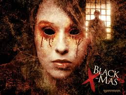 This title is inspired from films such as Black Christmas, which play on words quite cleverly. In this case, the two words when separated contrast as Christmas is a time of happiness, snow and joy whereas black connotes darkness and impurity. I think that Dark Summer could work just as well as Summer is a time of sun, youth and freedom but the darkness casts a shadow over this. This metaphor could link in to our movie because the girl, Summer, gets kidnapped, thus setting a tone for the rest of the film as we are trying to work out who abducted her.
Name: As the girl who goes missing within the film is called Summer, we decided to play with the name incorporating it in our film title. There is also ambiguity with Summer being both a name and a season and the word 'Dark' fits in with the genre Psychological Thriller as often has a dark plot.
Font: The font is called 'Distorted and Scratchy' (dafont.com) and I think it looks overall quite effective. It is bold and easy to read, the scratches of the text makes it seem edgy and shady.

Name: We have used the name of the missing child once again in our title and I think this name is quite strong. The word 'screams' connotes someone being in danger and trying to make themselves heard to get out of an unpreventable situation.
Font: This font is 'Times New Yorker', and the simplicity makes the text visually clear which is needed for the opening titles. The font is similar to the font used on a newspaper headline which, links with the aspect of crime. However, there are small ink smudges in the font that look quite rough and disturbed with.

Name: Abducted was the first name that we came up with and it is very simple and ties in with the narrative so that the audience can have a rough idea of the outline plot. However, there is also enigma as we do not know who or what has been abducted.
Font: 'Charles S' is the style of font and it fits in with the genre as it is bold and eery. I like the distortedness of the font because it is unique and is not the typical style of writing that you would see in other film openings.

Name: Masked was another suggestion made in our group meeting and it is another possibility. It does not give away much and there is hidden identity which links into the masked man who we see in the opening sequence. This can link to the plot in the rest of the film as it suggests that the man who appeared at the window plays a very important part in future events.
Font: This is 'Script Serif' also taken from dafont.com and is one of my favourites of the styles which I researched. I like the sharp edges and uneven boxes as it looks uncertain and has a mixed identity. This font stands out hugely and I think it would work well.

Name: This name is the most simple from the list and is to the point. Obviously, we can tell that it has relevance to something which has disappeared and faded away. However, this name may be too simple and not effective enough at delivering the overall message of the plot.
Font: The font style called 'All Used Up', is faded and this links to the fading away of something important. There are some parts which are bolder than the rest and the scratches show pain.
Sunday, January 31, 2010

Thursday, January 28, 2010
Contextual Research and Analysis: Without A Trace
Without A Trace is an American TV drama focusing on a fictitious full time FBI missing persons unit. The programme follows the same theme of kidnap and missing people as our film does. Though we are not making a TV drama, and though we are focusing on the side of the victim and the kidnapper and not the law, we can nevertheless take technical inspiration from it.
- As we are shooting the opening of a film, we can afford to be more creative with our camera work, unlike Without A Trace, as it is a TV programme. However, the promo above which advertises the programme seems to be more creative in its effects and its use of music and titles that the programme itself would be. We can therefore take some inspiration from it.
- The different shots in the promo are merged and connected with one another using a fade effect. It was probably used most effectively ten seconds into the clip, where another scene is faded over the young boy, with the titles stating "one boy's secrets". The boy being half hidden under another shot further adds to his secretive nature and to the theme of missing persons. We could attempt to do this when editing our sequence to further emphasise the theme of our opening.
18 seconds into the promo, we see a picture of the child who is missing. We could possibly add a photo of the child who has been taken away in our opening so as to further engage the audience with the film, as they become emotionally connected.
The music in the promo is very dramatic, and is edited well in accordance to the changing shots. Though we will not use such dramatic music, this promo shows us how good editing can help contribute to the entire mood of the clip.
Other Popular Media: Men/Masks

A mask takes the ability of knowing who or what something away. It is impossible to tell if the attacker is someone known, or a complete stranger. It sets up for a mystery that drags the viewer deeper into the horror film to see if they are able to find out who, or what, is behind the mask. A mask hides identity, connoting mystery and ambiguity, leaving the identity of the killer up to the imaginations of the audience.
A mask can allow a character to become superhuman, and impervious to pain. A perfect example of this is how the hockey mask was part of what caused Jason Voorhees to come back to life in the cemetery scene in Jason Lives: Friday the 13th Part VI.
 Also, Tomas in The Orphanage seems so mysterious and as he is a child wearing a mask it seems really freaky as we cannot tell if he is a murderer. At first, he appears to be the villain or have something to do with the disappearing boy, but we realise later that he was not involved in the abduction and is actually a ghost.
 Withholding information would work to our advantage because it keeps the audience guessing – even if they see the masked man and the other character doesn’t there is a mystery involved. The fear of the unknown is key to building the narrative of the opening sequence, but also for the movie as a whole. The mysterious man creates enigma, leaving the audience wanting to know more.

Wednesday, January 27, 2010
Furthur Analysis of Scream Opening

The opening of our film is very similar to the opening of Scream. We were very much inspired by several aspects of the opening and we adapted it to suit our own narrative and limitations:
Like Scream, the film starts with a young girl in a house. However, our protagonist is in someone else's house whilst the actress in Scream is in her own house. Our protagonist not being in her own house adds another level of mystery and tension to the opening of the film as the surrounding environment is not familiar to her.
- Though the use of a mobile phone will not be as significant to our opening as the house phone was to the opening of Scream, it is nevertheless important as it is a signifier of youth and technology. As well as this, our protagonist talking on the phone to the parents of the child she is babysitting helps us to introduce other characters without overcomplicating the opening.
Drew Barrymore dying at the end of the opening of Scream helped to set the tone for the rest of the film, as the audience were aware that the killer is still on the loose. The equilibrium first established was disrupted with her death. In our opening, though no one dies, the kidnap of the child represents the disruption of the initial equilibrium.
The full opening of Scream can be found on an earlier post, published by Michael
Target Audience
 Our core target audience will be male and female young adults aged 15-28.
- If this film were to be produced in reality, we would hope for a UK 15 rating so as not to exclude 15-18 year olds if it were to be rated 18 instead.
- We would target thriller and horror fans, as well as general fans of film and cinema.
- The female protagonist would appeal to females whilst the genre of the film (psychological thriller) would appeal both genders.

TARGET AUDIENCE: TYPICAL PROFILE
- They would be young (aged 15-28) and are either still in education and living at home, or are employed and living independantly.
 They would be very in touch and familiar with new media technologies and would often to exposed to or use technological products (e.g. Blackberry, iPhone, internet).
- They would often watch TV channels such as Channel 4 and e4, and would go to the cinema regularly as a means of entertainment.
- They download music, TV programmes and films regularly off the internet, either legally (e.g. iTunes) or illegally.
- They like to socialise with their friends and enjoy going out on Friday and Saturday nights.
- Their lives are predictable and are somewhat set in a routine, therefore they like to escape their everyday life by watching films of a voyeuristic nature, such as ours, which is a psychological thriller.

SECONDARY AUDIENCE
Our secondary audience could be identified as a more mature audience, of both sexes aged 28-38. Our film being a psychological thriller could appeal to this group of people as the film itself sets up a lot of questions and could be seen as quite mature in its narrative. Another example of a psychological thriller which appealed to both young and mature audiences of both sexes is Se7en.
As Se7en was such a success it shows that a film can target a secondary group of people without excluding their primary target audience.
Tuesday, January 26, 2010
Other Popular Media
Women in thrillers often portray a vulnerable character:
Popular films such as Halloween, Scream, Babysitter Wanted, Hostel Part 2 etc all use women who are attacked in some way by powerful men.
Halloween is a good example where the babysitter is attacked, but survives. Endings of films usually leave room for sequels and horror Franchises like Friday The 13th, Halloween and Nightmare on Elm Street have succeeded in achieving sult status, proving that the typical horror style can be successful (when they have a twist or surprise.)

Popular films such as Halloween, Scream, Babysitter Wanted, Hostel Part 2 etc all use women who are attacked in some way by powerful men.
Halloween is a good example where the babysitter is attacked, but survives. Endings of films usually leave room for sequels and horror Franchises like Friday The 13th, Halloween and Nightmare on Elm Street have succeeded in achieving sult status, proving that the typical horror style can be successful (when they have a twist or surprise.)

Women tend to be vulnerable, crying and even though locations may be familar, they are not normal to the character. (ie a babysitter in somebody else's house.) The sense of familiarity can be important for an audience. Even though films such as Avatar are successful because they break the boundaries, using futuristic locations and effects, it's always a good idea to have films that viewers can relate to.
Opening Sequence Research 2
When A Stranger Calls (2006)
- Looking at the trailer of this film, there are quite similar elements to our idea however, there will also be obvious differences in both plot and location.
- The Babysitter in this trailer is quite young and looks like the average teenager (relating to the audience of the film) so the person watching will be able to relate to her.
- She seems very unsuspecting, innocent and terrified of the events unfolding. We should try and capture these feelings and concepts with the actor that we use.
- I particularly like the shot where the camera approaches the girl who has her back to us as it looks like something is creeping towards the babysitter while she is unaware.
- Also, the key words that the trailer highlights are: 'Alone', 'Isolated' and 'Trapped' and these are three themes which are effective and themes that I think we should try and capture.
- We could achieve this greatly through the editing as we could alter the pace with fades and cuts. With quick cuts during the fast-paced actions and slow fades when the girl is on her own.
- There is a big element of stalking and abduction within this film so we could analyse the way that the director presents this to influence us during our production stages.

Opening Sequence Research 1
There are current films which relate to our idea particularly with the innocent girl at home concept and sense of suspense created. After watching clips from these films, there are various techniques used that we can take as inspiration from for our final piece.
Scream (1996)

Scream (1996)
- The main focus is on the phone which is a key prop in the film, it begins with a simple shot so it is not too complicated and allows the audience to establish a sense of location etc..
- The main actor within the opening sequence is very young and looksvery innocent and vulnerable as we see her alone in this house.
- A very effective part is the tracking of the girl as the camera follows her movements throughout the kitchen. This involves the audience as we follow the path that she takes throughout the room. I think this would be a good camera technique to use in our openng.
- The darkness from outside connotes mystery as she is alone at night. Also, there is a slow build up until the actual event and this builds suspense of what will happen next- leaving the audience guessing.
- Also, later on in the actual film (not shown in the clip), the man taunting the girl is seen by the audience wearing the iconic scream mask. We could think about the possibility of having the man in our opening wearing a mask as I think mystery would be created in not knowing the face that lies behind this mask.

Genre: Psychological Thriller

The genre of our opening sequence will be Psychological Thriller, this sub-genre is very popular and there have been many successful films from this category. Psychological thrillers incorporate both mystery and drama with the focus being on the plot, with the aim of creating this enigma. Famous examples that inspire us are: Fatal Attraction, American Psycho, Se7en, The Changeling and Silence of the Lambs. These films are seen as some of the most successful Psychological Thrillers and the suspense that is build throughout them will definitely influence our final project.
Contextual Research
The opening of our film centres around the discovery of the disappearance and apparent abduction of a young child. Over the past couple of years, there have been a number of kidnapping cases all over the world, most notably the Madeline McCann Case, the Jaycee Lee Dugard Case and the Josef Fritzl Case.
The media hype generated over these crimes mean that knowledge of them is commonplace, and that the majority of people around the world would be able to understand the nature and gravity of the crimes committed.
These events being of such relevance to the 21st C mean that the film would appeal to many around the world, both to young adults and people of a more mature age.
THE MADELINE MCCANN CASE


The media hype generated over these crimes mean that knowledge of them is commonplace, and that the majority of people around the world would be able to understand the nature and gravity of the crimes committed.
These events being of such relevance to the 21st C mean that the film would appeal to many around the world, both to young adults and people of a more mature age.
THE MADELINE MCCANN CASE

The Madeline McCann Case is probably the most famous kidnapping case to date. She still has not been found. This case shows us how easily a child can be abducted and how vulnerable and helpless they are in the apparent safety of their room. Our film opening relates to this case as it depicts a child being taken whilst they were asleep, as Madeline was.
THE JAYCEE LEE DUGARD CASE

The Jaycee Lee Dugard Case demonstrates clearly how easy it is to adbuct a child. Jaycee was taken at a school bus stop nearby her house, in full view of her step-father and several school-mates. This case shows the audience how easy it is for someone to be kidnapped and how helpless those that should protect them (babysitter/ parents) become.
THE JOSEF FRITZL CASE

The Josef Fritzl Case is possibly the most widely reported case of abduction, rape and incest. The fact that these heinous crimes were committed by the girl's father shows us that no child is safe even from their parents. The audience, when watching the opening sequence will draw on this case when wondering about the identity of the kidnapper of the child.
Monday, January 25, 2010
Group Meeting 1
20th January 2010
1st Group Meeting
9:30-10.50am
Ideas for opening:
Winnie:
Follow a woman doing her daily routine - equilibrium established. Cup falls on floor + disrupts normality. She sees something scary. (Blood? Body?)
Michael:
Lone, vunlnerable woman at home. Dark - afternoon maybe? A man at the window- audience sees but she doesn't- enigmatic as she hasn't seen the man. Will she discover who he is?
Anisah
Babysitter arrives at house. The parents are going out and teenager is taking care of child. She goes to watch TV but there is a power cut. She runs to check on the child but he is gone-bedcovers are messed up, signifying someone was there and window is open. Tense, scary moment of realisation.
 The part where the man is at the window is similar to that in The Box. The man looks scary and very strange. In the film, however, the character sees this man, which freaks her out. We thought it would be more chilling if the character was unaware of his presence, as it gives the audience something to think about - they may have the upper hand as they have seen him but they still do not know who he is.
1st Group Meeting
9:30-10.50am
Ideas for opening:
Winnie:
Follow a woman doing her daily routine - equilibrium established. Cup falls on floor + disrupts normality. She sees something scary. (Blood? Body?)
Michael:
Lone, vunlnerable woman at home. Dark - afternoon maybe? A man at the window- audience sees but she doesn't- enigmatic as she hasn't seen the man. Will she discover who he is?
Anisah
Babysitter arrives at house. The parents are going out and teenager is taking care of child. She goes to watch TV but there is a power cut. She runs to check on the child but he is gone-bedcovers are messed up, signifying someone was there and window is open. Tense, scary moment of realisation.
- All our ideas have a vulnerable woman at the centre of the plot
- We have decided to draw on themes from all 3 proposals:
- Babysitter is in house, on the phone to parents telling them that their child is in bed
- She goes to the fridge to get a drink
- There is a man at the window - the audience sees but teen doesn't, as her back is turned.
- She hears a scream and banging coming from the bedroom. This startles her and she drops the cup, the drink spilling on the floror
- She runs into the child's room to see if she is safe. The bed covers and window are open-has someone been here?
- Enigma created- questions asked. Where is the child? Who was the man? Did he kidnap the her?
 The part where the man is at the window is similar to that in The Box. The man looks scary and very strange. In the film, however, the character sees this man, which freaks her out. We thought it would be more chilling if the character was unaware of his presence, as it gives the audience something to think about - they may have the upper hand as they have seen him but they still do not know who he is.
Subscribe to:
Posts (Atom)
